We’ve been developing some safety training for folks who work around high-voltage electrical systems. It’s a good feeling, knowing that this course might actually save lives.
I looked at one of the key graphics the other day, and it just wasn’t communicating clearly. You had to think about it a bit to figure it out. It was on screen for only 6 seconds, though, and during that time there was also narration going on.
I started thinking that instructional design has a lot in common with billboard design. We need to get the idea across as clearly as possible, as quickly as possible. We want people to remember our message, not struggle to figure it out. We can’t count on their undivided attention, and we have only a few seconds before we lose their attention altogether.
Look at these examples of great billboard design. How long does it take you to get the point?
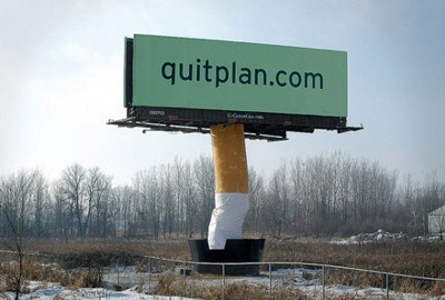
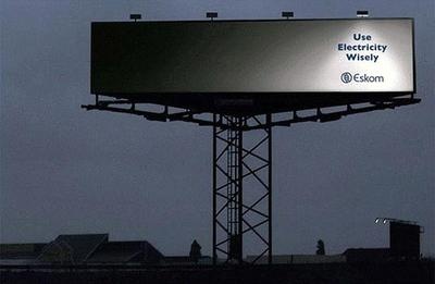
They get the point across almost instantly, don’t they? Granted they both go beyond the confines of the billboard itself, but that makes them even better examples of creative thinking. To see more examples, just search for “great billboards” or a similar search term. Also check out http://www.designmybillboard.com/designprinciples.htm and http://www.meadowoutdoor.com/billboard-design/guidelines for some useful design tips.
Here’s our chart before and after revision. Both versions show that the length of a hospital stay decreases dramatically for the worst burns. I think the revised version does a better job explaining why.
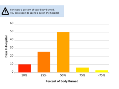
In the first version, the color progression is confusing: we usually think of yellow as less dangerous than red. In addition, you can see that hospital stays get shorter with worse injuries, but you might wonder why.
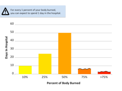
The revised version uses color in a more conventional way, and the jagged black lines illustrate that the hospital stay is shorter because it’s cut off.
What do you think? Is it an improvement? Feel free to give us some feedback in the Comments.
(by Rissa Karpoff)

I think you are really onto something making the information needed like a billboard and instant in it’s communication. The new chart is a definite improvement. Is the point to incentivize people to be careful around electricity to minimize hospital stays? If the aim is to prevent electric burns in the first place, what about a visceral graphic that they can not forget showing the damage caused by 1st, 2nd and 3rd degree electrical burns. If it is to minimize the damage from an electrocution perhaps a vivid graphic depicting the first steps in burn management. Thank you for your service in protecting lives through your work! I have an Uncle that still consults for Orlando Power, it’s great that you are making a difference with your life’s work.
LikeLike
Thanks Dawn. Keep in mind that this was just one bit of one slide in a course that was more than 2 hours long. We did include some very visceral images of burns. It was hard to do, but it makes a point.
LikeLike
Rissa – I think this is an instance where a chart graphic doesn’t really add value. On the graph 10% = 10 days, 25=25, 50=50, (i.e. linear progression) but then 75% and >75% are cut off only because you chose the vertical scale to not accommodate those numbers – leading to confusion. I would think that a better presentation would be to increase the size and boldness of the statement sentence (stating 1% = 1 day), then illustrate it with some month calendar icons – 1% would show a day blocked out, … 50% would have the better part of two month icons blocked out. If the intent of the graphic is to relate the injury to hospital stay, something that people immediately associate with multi-day time spans (i.e. a calendar graphic) would have more immediate engagement that the y-axis of a labeled graph. – Kurt W
LikeLike
Thanks for the suggestion, Kurt. The course has been released but I’ll keep it in mind for future revisions.
LikeLike